The anatomy of a business homepage in 2026: 10 elements that convert, 5 to drop


Short answer: A 2026 homepage converts when it answers three questions in five seconds, what you sell, who for, and what the next step is, and gives the visitor one clear path forward. Ten elements are non-negotiable: a hero value proposition, social proof, a single primary CTA, a named target audience, a service summary, a concrete result, case samples, an FAQ, an about snippet, and a low-friction contact point. Five things are worth dropping: carousels, autoplay video, "Welcome" copy, generic stock photos, and CTA overload.
Your homepage is the most important page on your site. Often 30–60% of all visitors land there, and it is effectively the one warm-up step before a first contact. We have built 300+ homepages across industries, and the same list of non-negotiable elements works for almost all of them. Here it is in its 2026 form, updated for the AI Overviews era.
The 10 elements you need
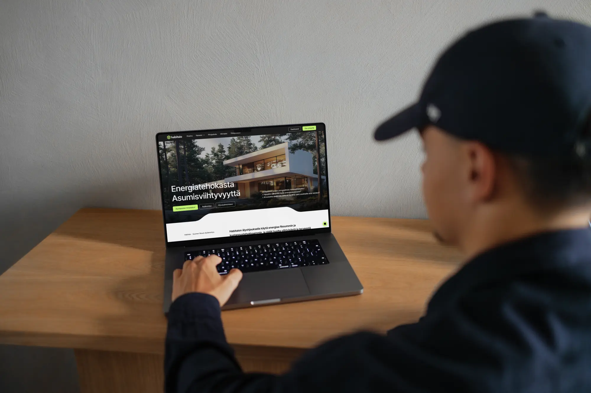
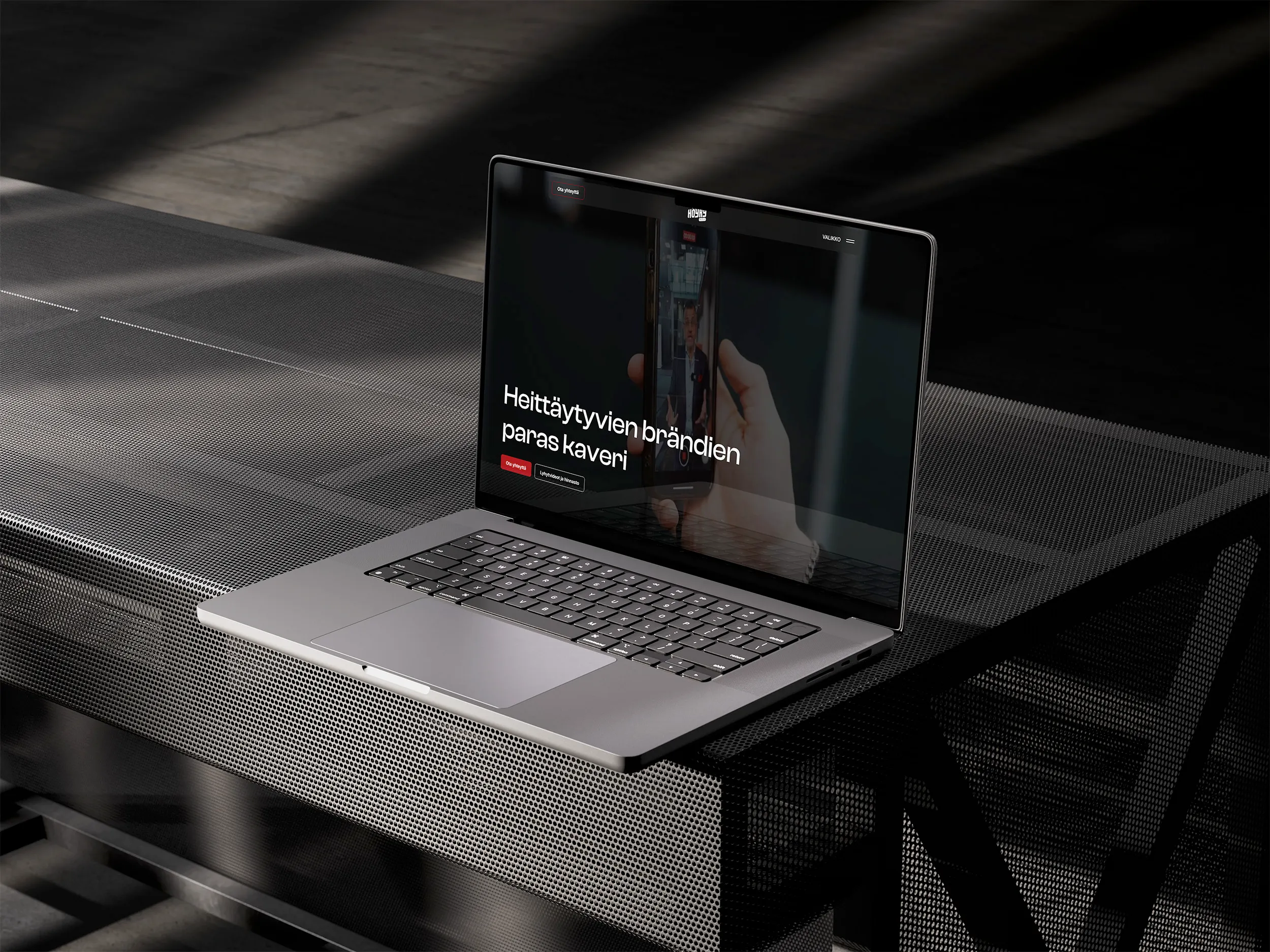
1. A one-sentence value proposition at the top of the hero
This is the most important element. The visitor reads it first. It has to say what the company does, who for, and why the customer should care.
- ❌ "Welcome to Company Inc., 30 years of experience!"
- ✅ "Websites for businesses that want to show up in Google and AI search."
Keep it under 12 words. Do not try to say everything, say the most important thing.
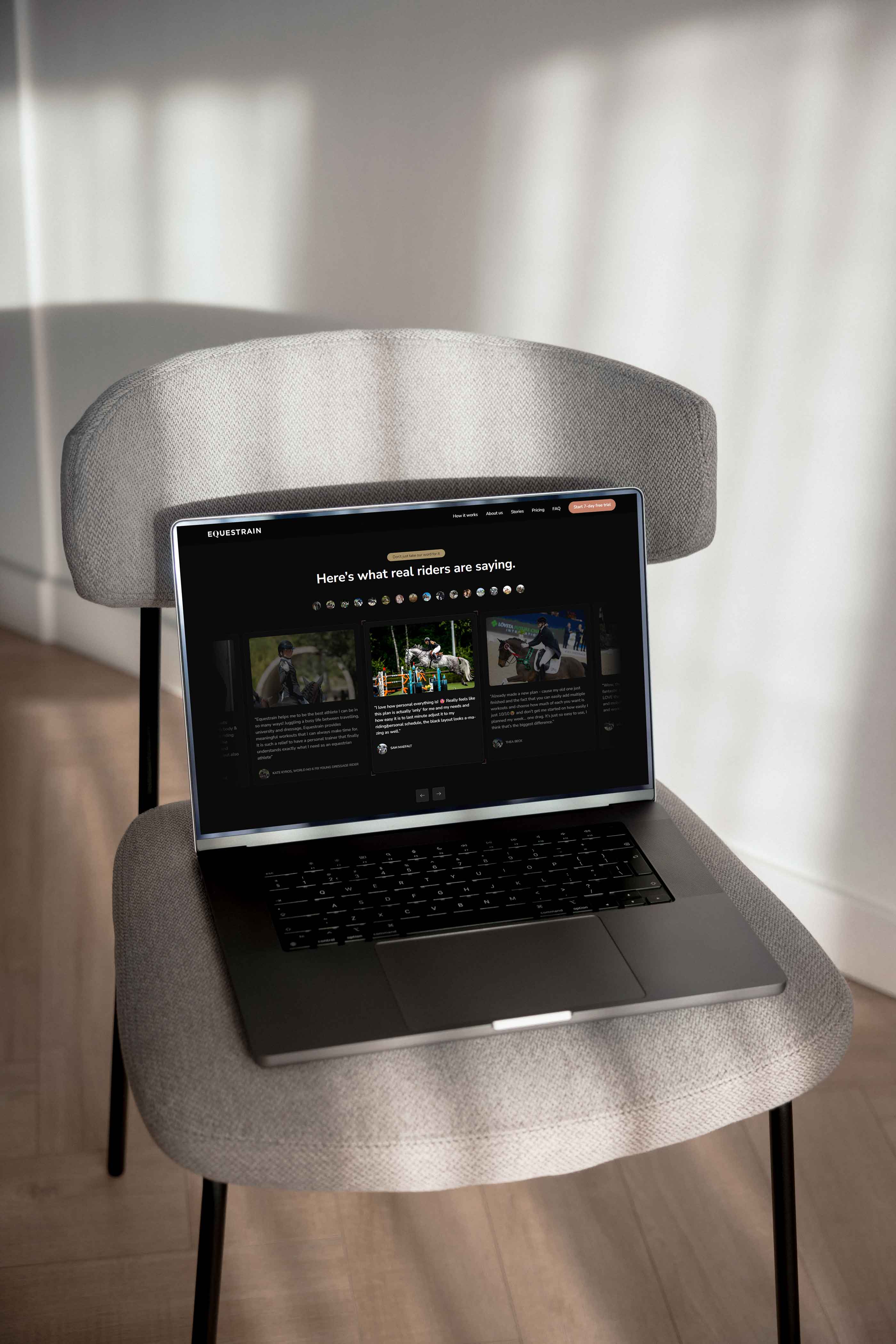
2. Social proof at the top, not on a subpage
Client logos, numbers ("300+ projects"), reviews, or a quote from a leading client. This is the most important trust element in B2B sales, and it has to show above the fold, not at the bottom of the page where visitors rarely reach.
In B2B sales, decision-makers usually look for social proof before they believe the value proposition. Leaving social proof on a subpage is like putting the warranty card after the checkout.
3. One primary CTA above the fold, one, not five
One main action the visitor is meant to take. On a homepage that is usually "Request a quote" or "Book a consultation." You can have secondary CTAs (for example "Download the guide"), but they are visually smaller and do not compete with the main CTA.
Several large CTAs at once lower conversion: the visitor freezes on the decision of which to press first, and ends up pressing neither (they leave). Read more about full-funnel thinking.
4. A clear mention of who it is for
A visitor decides in five seconds whether the site is "for me." Help that decision by saying directly who the customer is:
- ❌ "We provide services to organizations."
- ✅ "Custom websites for 5–50 person B2B service companies."
Specific beats general, even when specific is a smaller audience. The fear of narrowing it down too much usually works the other way around: the buyer wants to see that the company understands their exact situation.
5. A service summary at a glance
3–4 core services that are immediately visible. Use icons, short headings, and one-sentence descriptions. A link under each goes to the pillar page.
Do not list dozens of services, the visitor will not remember them and will not click through. If you have more, group them into 3–4 categories and open the rest on a dedicated services hub page.
6. A concrete result or benefit, numbers, not adjectives
"Client conversion rose by an average of 12% after the redesign" beats "Clients have been very satisfied."
The building blocks of a result claim that works:
- A metric (% growth, money saved, time saved)
- A timeframe (3 months, within a year, after the project shipped)
- Customer context (which industry, which size of company)
A number without context ("99% satisfaction") is weaker than a number in context ("12% conversion growth in 6 months, averaged across B2B service companies").
7. Client or case samples (1–3 recent ones)
One or more completed projects shown with a logo, an image, and a one-sentence result. A link goes to the detailed case page.
What matters most is recency: a case from last year works, a case from 2018 is suspicious (what has the company done since?). Rotate the cases section every six months.
8. An FAQ section with FAQPage schema
5–8 of the most common sales questions: price, timeline, process, maintenance. It works on two levels:
- For the user: it answers their question before they get in touch, lowering the barrier to contact.
- For AI Overviews and LLM systems: FAQPage schema is one of the strongest signals for a page being picked as a source in an AI answer. Read the GEO pillar guide for why this matters in 2026.
Add schema.org/FAQPage as JSON-LD in the Custom Code field. In Webflow, per CMS item or at the page level.
9. An about snippet plus the people on the team
A short "who we are" section on the homepage, a photo of the team or the key people, and their names and roles. A link to the About page for the bigger story.
E-E-A-T (Experience, Expertise, Authoritativeness, Trustworthiness) is Google's criteria set, and LLMs use the same signals. An anonymous company with no visible people loses to a recognizable company with names, faces, and linked LinkedIn profiles.
10. A low-friction contact point in the footer or a popup
Do not rely on the visitor clicking through to a "Contact" page. Make getting in touch easy straight from the homepage:
- An AI chatbot in a popup (24/7 response, when it pays off)
- A contact bar in the footer: name, email, one open field
- A direct phone number visible (in B2B sales where the average deal is over $5,000)
A visitor who liked the value proposition but did not commit can come back to this contact point before closing the tab.
The 5 elements worth dropping
1. Sliders and carousels
Users do not browse a carousel. A well-known University of Notre Dame study found that only about 1% of visitors click a second carousel element, and Nielsen Norman Group has reproduced the result in several tests.
Whatever the carousel says, you can place it as static content below the hero. One message everyone sees beats five messages nobody reads.
2. Autoplay video with sound
Mobile devices mute autoplay video by default, and on office desktops sudden sound is noticeably disruptive. On top of that, it:
- Uses mobile data without asking
- Is an accessibility problem for people with hearing impairments
- Slows down LCP (Core Web Vitals)
If you want video on the homepage, use muted by default and loop. But often one good image beats a mediocre video.
3. "Welcome to our site!" or "Company Inc. is the leading..."
Neither tells the visitor what the company does. They use up the hero space where the value proposition should be.
Swap in:
- ❌ "Welcome! We are a leading service provider."
- ✅ "Websites for B2B companies that want to show up in search and convert leads."
4. Generic stock photos (handshake, meeting, typewriter)
Stock photos do not build trust, they actually lower it. The visitor notices the image is not real, and connects it to the idea that the rest of the site might not be either.
Alternatives:
- Your own photos of the team or the work (best)
- Custom illustrations or icons (works well for abstract services)
- Real project images from clients
- Brand colors and typography (if there is no photo)
No image is better than a bad image.
5. Every CTA on the homepage at once
"Request a quote" plus "Download the guide" plus "Book a consultation" plus "Sign up for the newsletter" plus "Request a demo", five buttons, all alike, and the visitor does not know which one matters.
One primary CTA. At most one secondary (lower weight, for example a text link). Drop the rest from the homepage, their place is on service pages or the blog, where the context is more specific.
Summary: a checklist before you publish the homepage
The required 10:
- Hero value proposition under 12 words
- Social proof above the fold
- One primary CTA, not five
- Target audience named directly
- 3–4 core services at a glance
- A concrete result (a number, not an adjective)
- 1–3 case samples from the last year
- An FAQ section with FAQPage schema
- An about snippet plus names and faces
- A low-friction contact point visible
The 5 to avoid:
- Carousels
- Autoplay video with sound
- "Welcome"-type hero copy
- Generic stock photos
- CTA overload (5+ at once)
If three or more of the required elements are missing, or two or more of the ones to avoid are present, your homepage has room to improve that probably costs you more than a redesign would.
Wondering whether your homepage meets the 2026 standard? Request a free 30-minute homepage review, we go through the checklist against your site and give you an honest read on whether it is worth improving, redesigning, or leaving alone.